
Tile Talk
Todays blog session is all about how to select tiles for a whole-home build without being basic. If you need a crash course on tile here is your daily read! Now let’s talk design!
TIP #1: STICK TO A COLOR PALETTE.
This is one of the things that I emphasize on the most! Pick a color palette that you’re happy with and STICK. TO. IT. In general, your color palette should be within 2-3 colors, though 3-4 is also acceptable; anything more and the whole thing could start looking like the discard pile at your local tile mart. The easiest way to pick colors is to first pick a style- design aesthetic for your home then pick 4 colors schemes you would want to incorporate, this could be wall paint, stain color, countertops, or flooring and we can pull from those materials to pick tiles that flow and compliment those finishes!
TIP #2: VARY YOUR SCALE AND PATTERN.
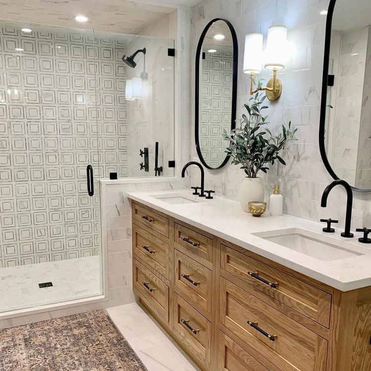
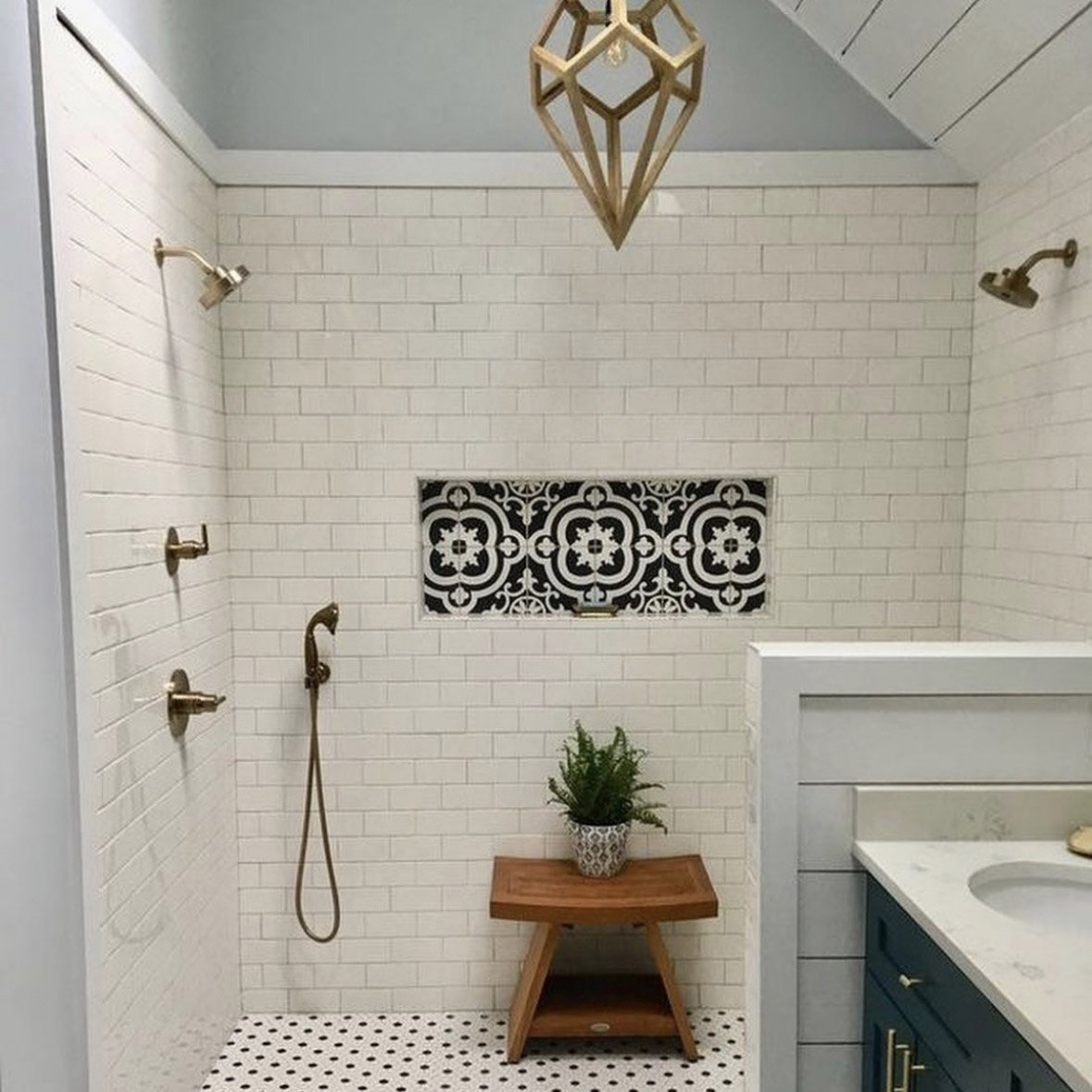
Once you’ve picked your color palette, you can start playing even more. Tiles come in all kinds of regular and fun shapes and designs vary from solids to geometrics and intricate patterns. The key to successfully mixing these (without becoming too busy) is changing up your tile’s sizes and patterns—think large and small; combine busier patterns with classic shapes and solid colors; maybe even use the same tile, but lay them out differently (and make one or two less prominent by picking the right shade of grout…but more on that later).
As with colors, I’d advise you to exercise some restraint when combining shapes and patterns—two to three different ones is a good rule of thumb. You might be able to get away with four, but keep in mind that the room you’re designing probably isn’t made entirely out of tiles. Be aware of any other materials in the room that might create a pattern that could make your design cross over into “busy” territory.
TIP #3: BE MINDFUL OF YOUR GROUT CHOICES.
Now I mentioned grout a little bit above, and I don’t know if this goes for everyone or if it’s just in the nature of designers to stress about every little thing, but your grout choice should not be an afterthought. It’s a thing that TMC design team definitely likes to keep in mind because the right grout color and thickness has a way of emphasizing or de-emphasizing a tile’s shape and/or pattern.
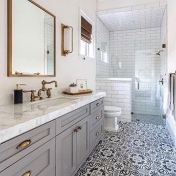
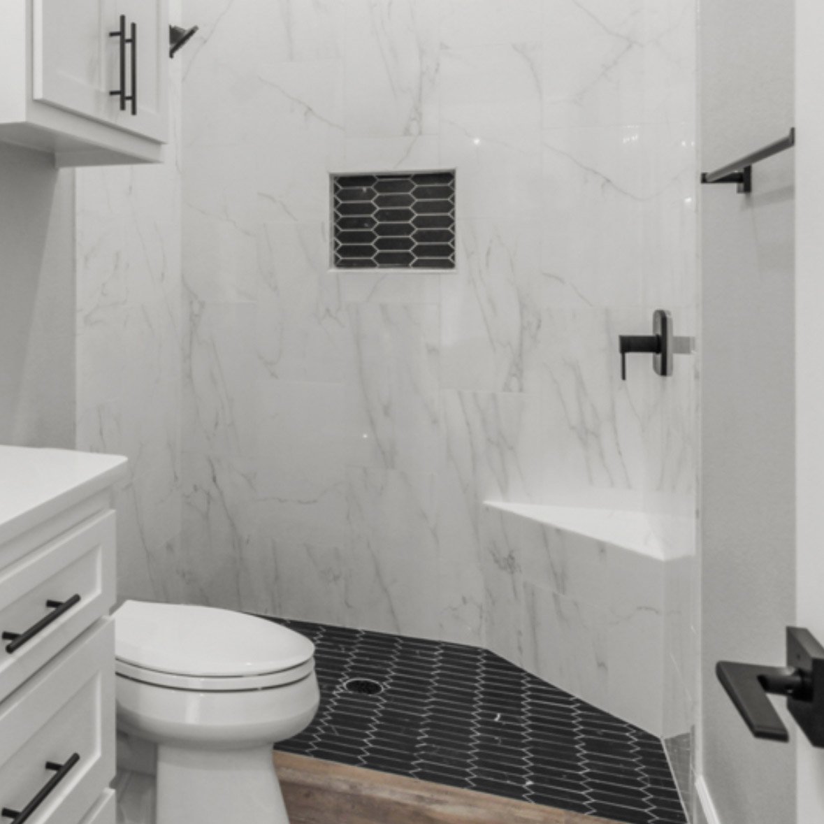
Matching grout color to your chosen tile is a great idea if your tile is richly pigmented and patterned, meaning you want the tile to stand out more than the grout lines. We recommend choosing a grout color that is one shade lighter or darker than the tile for the best color blend and overall look. For instance, if your tiles are a gray marble, consider white grout for your shower design.
Selecting a grout color that contrasts with your tile is ideal if you want to draw attention to the pattern/layout of the overall tile instead of the individual tiles. For example, dark gray grout color is widely used with white subway tile for a striking contrast that feels both vintage and modern. We also recommend contrasting grout when the tiles are subdued or have veins of color running throughout, as the grout will help to draw out those accent colors and make the wall or floor look even more stunning.
TIP #4: MIX UP FINISHES, BUT DON’T COMPROMISE FUNCTION OVER FORM.
Great design is about giving a treat to as many of your senses as possible. You want to mix up enough design elements to keep your eyes bouncing around, but also pair different textures to give yourself a great tactile experience.
Tile finishes depend on the glaze used on them, and your finish options could range from the standard glossy, satin and matte finishes to special finishes like watercolor, crackle, metallic, and artesian.
My advice to keep things interesting (especially if you’re using the same tile throughout, but varying the scale and/or layout pattern) is to mix up your tile finishes. Combine at least two different finishes, but be smart about it—think of where your material is going and how you and your family will interact with it, then choose appropriately. (DESIGNER HOT TIP: the basic principles of interior design says consider function first always, then comfort and safety, followed by cost, and LASTLY, aesthetic.) In general, matte (or honed) tiles are a go-to for flooring, especially in wet areas, because of their non-skid, non-slip properties. And in kitchens or areas where you foresee lots of dirt and staining, save yourself the nightmare and go for the glazed option instead of an unglazed matte…unless you’re prepared to do a little more upkeep.
As always, take cues from your other non-tile materials and figure out which materials with what finishes are your non-negotiables. If you’d rather pick polished wood or create texture with your textiles and pick one finish for all your tiles, then by. all. means. It’s all about balance (both between your tile selections and the rest of your home’s materials). Because really at the end of the day, the heart will want what it wants, amirite? Thanks for sticking with me on this lengthy TILE TALk, and as always we are always here to guide you through the design process!
XOXO,
Chelsea Montgomery
Lead Designer
TMC Custom Homes